Project Description
Three Lime Pines is my personal blog, website, and brand. The purpose of the site is to educate and provide resources for women who are wanting to create new habits for their home and life. The website has been a 3 year side project and has gone through many iterations. The process outlined below is the latest update for the site that is in process.
For the website design, I have used the WordPress Total theme with the WPBakery as a drag/drop back end editor. The site includes embedded forms, basic HTML revisions, and plugins.
The Team
Jessica Hardin - Project Lead, UX Designer, UX Researcher, UI Designer
Jon Sulzbach - Graphic Designer for the Three Lime Pines Logo
Skills
Research and Analysis
Organizing Information
Wireframing
Prototyping and Testing
Visual and UI Design
Design for Development
Project Management
Tools
Adobe XD
Photoshop
Illustrator
Canva
Internet
WordPress
Typeform
Understanding the Audience
Prior to diving into the website build, I researched the target audience for my blog. I wanted to create a full picture of (1) who would I be writing for, and (2) what the website needs to communicate to attract that ideal person. Based off Typeform surveys and Instagram polls, I put together the persona profile below to represent the one person that I would be writing to in my posts, website copywriting, and user experience.
Left: Persona Profile of Jenna / Right: Empathy Map of Jenna
Mapping Site Content
During the process of mapping the site, the page flow is designed with Jenna in mind. The layout is prioritizing and guiding Jenna to the resources, courses, and information about the topic she will be looking for on the site. The footer allows for a secondary prioritization for when Jenna is ready for more resources, information on the website, and has signed up for a course. With this flow, it allows for additional landing pages to expand the site map.
Creating the Visual Identity
For the visual identity of Three Lime Pines, I wanted to it have warm earthy tones, and to connect in a whimsical, yet sophisticated way. It needed to have a bright and mid-century modern vibe going with botanicals to give life to the brand.
Creating the logo, I worked with a Graphic Designer, Jon Sulzbach. He created 3-5 logo designs inspired by sketches that I emailed. The final logo beautifully pulled together the Three Lime Pines story while infusing that whimsy and sophistication into the brand.
Creating the Website
The wire frames, created in Adobe XD, are a representation of the upcoming revisions to the site. I wanted to design them with Jenna in mind, and make sure the breadth of content is easy to find. As the site evolves, it also needs to be conducive to e-commerce and online video education. The wire frames below are a reorganization of the current site with the fresh information architecture and an updated user experience flow.
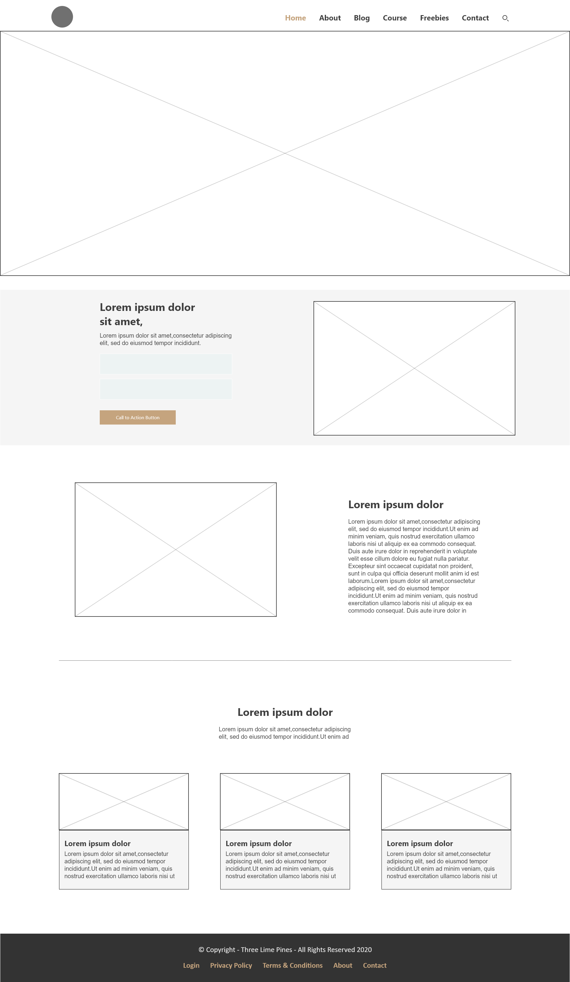
Home
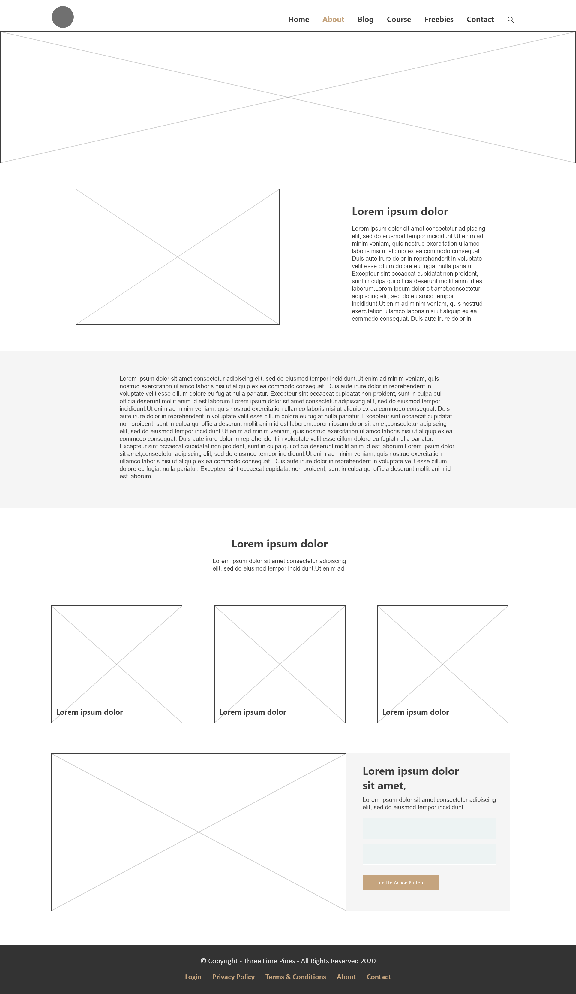
About
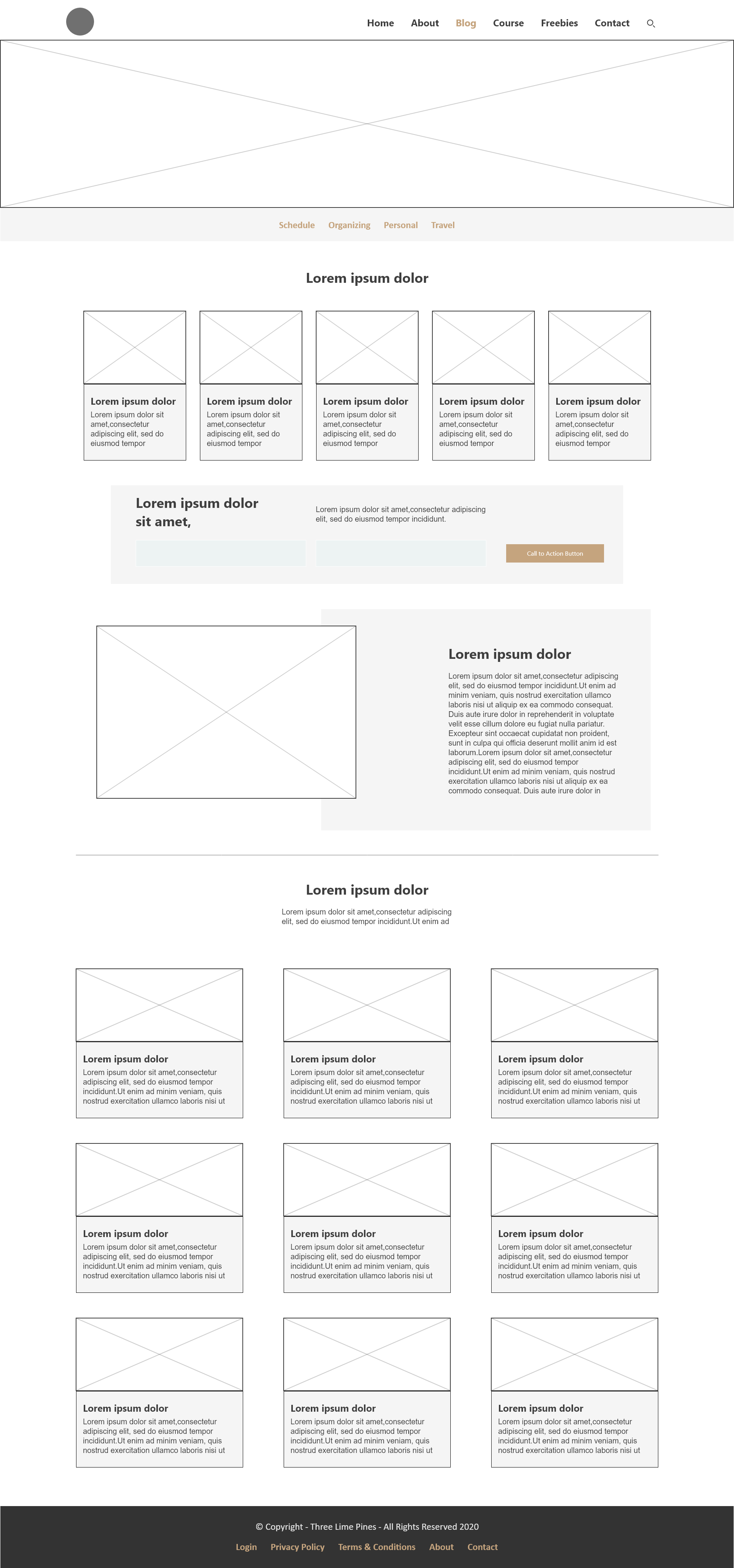
Blog
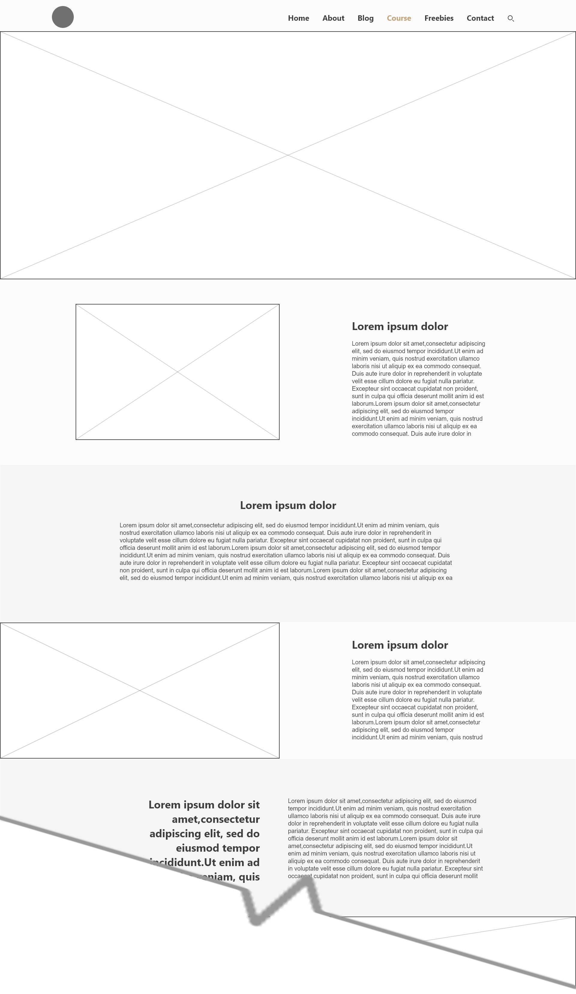
Course (long form sales page)
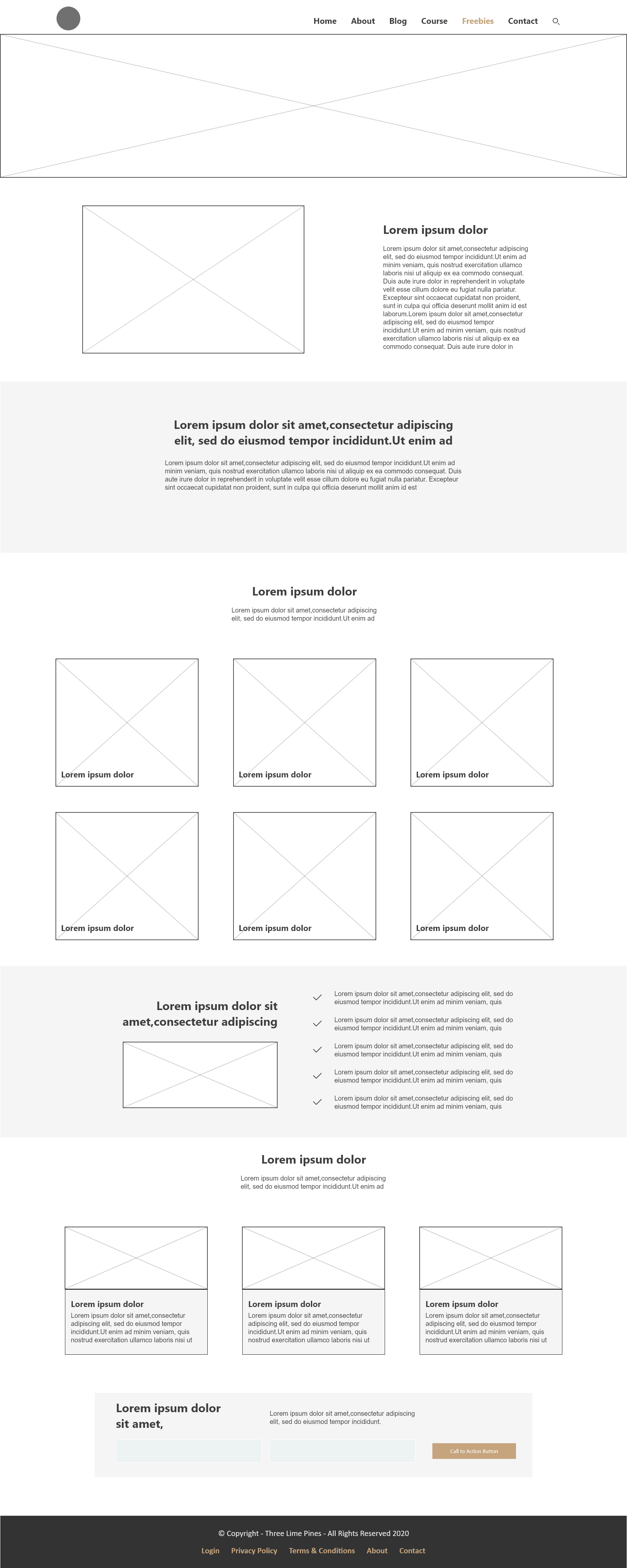
Freebies
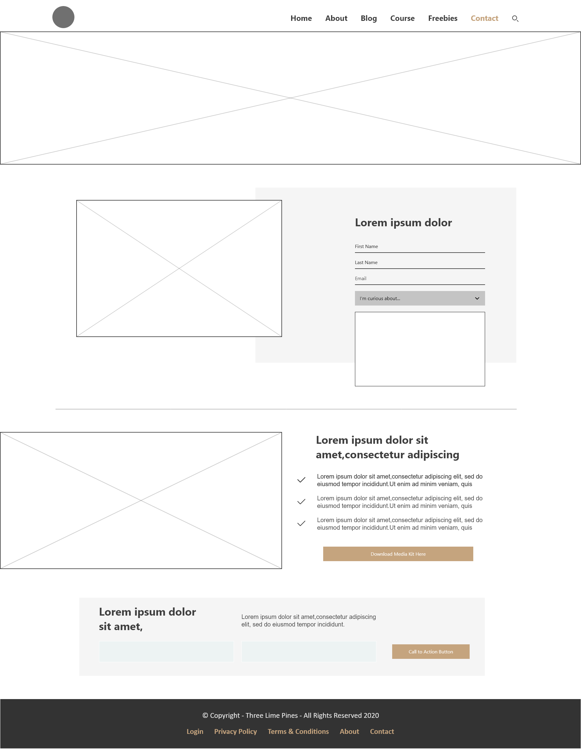
Contact
The Result
The anticipated result with the Three Lime Pines site updates are that the site will be easier for each visitor to navigate, whether they arrive by clicking a link from a post, or they enter on the Home page. As the information architecture of the site expands to include e-commerce, and online video education content, the site needs to seamlessly attract and repel the right audience - an audience that is wanting to organize their home and life.
